
Updating an e-commerce technology is also a good design opportunity to review the customer experience and refresh the look and feel. Backcountry.com is a big player in the online retail industry specialized in clothing and outdoor recreation apparel. Ready for an adventure?
Context
Backcountry is a premier online specialty retailer catering to outdoor enthusiasts, offering a curated selection of gear, apparel, and equipment. Founded in 1996 in Salt Lake City, the company has grown into an industry leader, generating annual revenues exceeding $500 million and employing over 1,000 people.
In mid-2021, Backcountry leadership identified a strategic opportunity to modernize its digital presence. Beyond upgrading the underlying technology and consolidating all UI stacks into a single framework—Next.js—the initiative presented a pivotal moment to reassess and enhance the user experience. This effort was not just a technical migration but a chance to refine usability, ensure design consistency, and strengthen the brand’s digital ecosystem across multiple platforms.
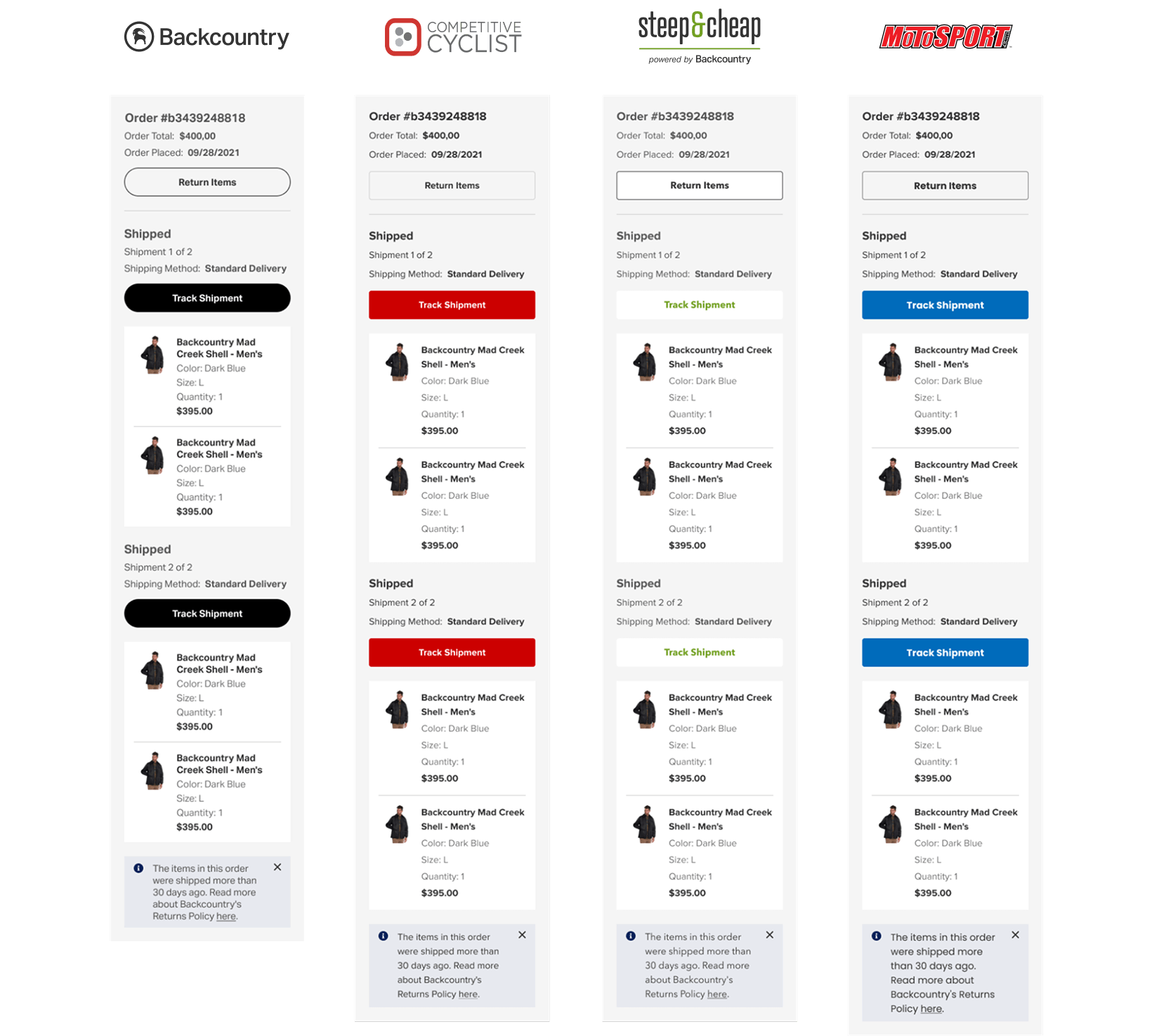
With four distinct websites under its umbrella—Backcountry.com, CompetitiveCyclist.com, SteepandCheap.com, and MotoSport.com—the company faced significant UI inconsistencies and fragmentation. Each platform had evolved independently, leading to a disjointed experience for users navigating between them. While a full redesign was not in scope at this stage, it was a opportunity to review the interfaces, align them with best practices, and seamlessly integrate them with the design system.
This was an ambitious undertaking, requiring the design and adaptation of nearly 1,500 screens across five different breakpoints. The work had to be done efficiently and collaboratively, balancing business goals, technical feasibility, and user needs.
Actions
Strategic Collaboration & Team Structure
I played a dual role in this initiative, working across two teams. Within my company’s pod, I collaborated with a product manager, six engineers, and two quality specialists to execute the technical implementation and ensure a smooth design handoff. Simultaneously, I was embedded in Backcountry’s design team to enhance UI consistency and later contribute with the design system. With teams distributed across multiple time zones, structured collaboration through regular syncs, design critiques, and roadmap discussions was essential to ensuring a cohesive final outcome.
This cross-functional setup required clear and structured collaboration. The Backcountry design team was led by Casey Telenko (UX Manager), who provided strategic oversight and help with alignment between all stakeholders. Given the complexity of the initiative, regular syncs, design critiques, roadmap discussions, and collaborative workshops were essential to maintaining cohesion across teams and ensuring that the final design solutions met business and user needs.
Goals
The design main goal was to review all components from four websites under Backcountry’s umbrella seeking for opportunities to update them and connect to the design system.
Rather than a full redesign, the focus was on refreshing the user interface by implementing best practices, identifying quick wins, and optimizing key entry points and small interactions to enhance usability.
Research
Since the primary objective of this project was a technology replacement, our research strategy prioritized speed and efficiency. To stay within budget and meet tight deadlines, we opted for a lean design approach, choosing methods that provided actionable insights. We focused on heuristic evaluations and competitive analysis, allowing us to quickly identify user-centered opportunities for improvement and deliver results efficiently.
In the first two weeks, we began by reviewing all main pages and their respective components. Once we had a clear inventory, I conducted heuristic evaluations for them. As insights accumulated, we categorized them based on complexity—critical issues, moderate improvements, and minor refinements. Working closely with the Design Manager and Product Manager, we prioritized these findings and established a roadmap, ensuring alignment with the development team.
We also defined the direct and indirect competitors. The idea was to learn fast with their solutions and adapt to our reality. The team came up with five main:
- REI (Recreational Equipment, Inc.): A major outdoor retailer offering gear, clothing, and equipment for various outdoor activities, with a strong emphasis on sustainability and a co-op membership model.
- Moosejaw:Known for its outdoor apparel and gear, Moosejaw competes with Backcountry by offering a wide range of products and a fun, irreverent brand personality.
- Patagonia:While primarily a brand rather than a retailer, Patagonia competes by selling high-quality outdoor clothing and gear directly to consumers, often appealing to environmentally conscious shoppers.
- The North FaceAnother strong direct-to-consumer brand that competes with Backcountry in the outdoor apparel and gear space, with a reputation for durability and performance.
- CampSaverA discount-focused outdoor gear retailer that competes with Backcountry by offering deals on premium outdoor brands, catering to budget-conscious adventure seekers.
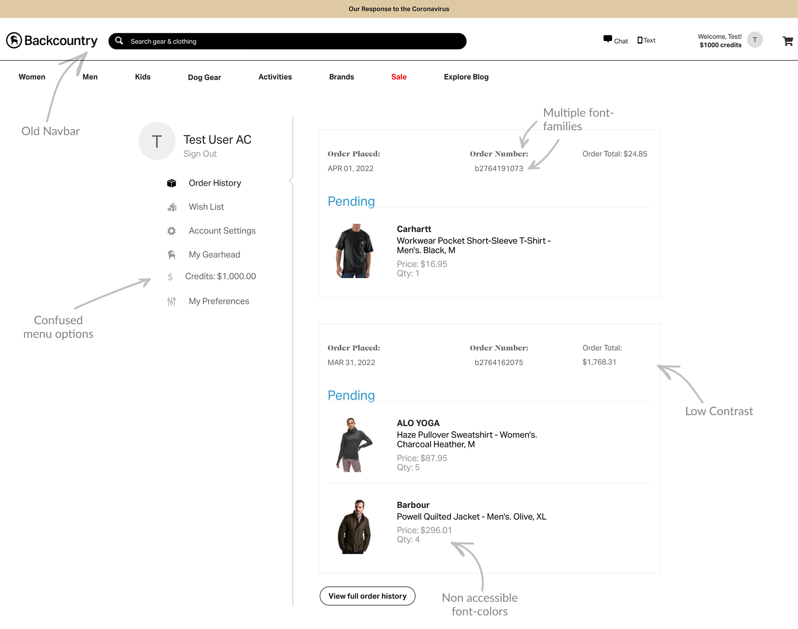
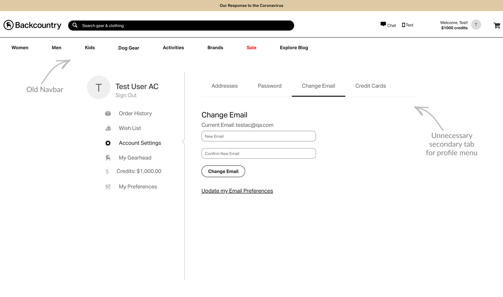
Here are some issues examples of the current website experience:

Design
The combinations of small tweaks resulted in a great interface improvement. I also incorporated some new elements that were already being tested by the Backcountry team, such as the new universal bar.
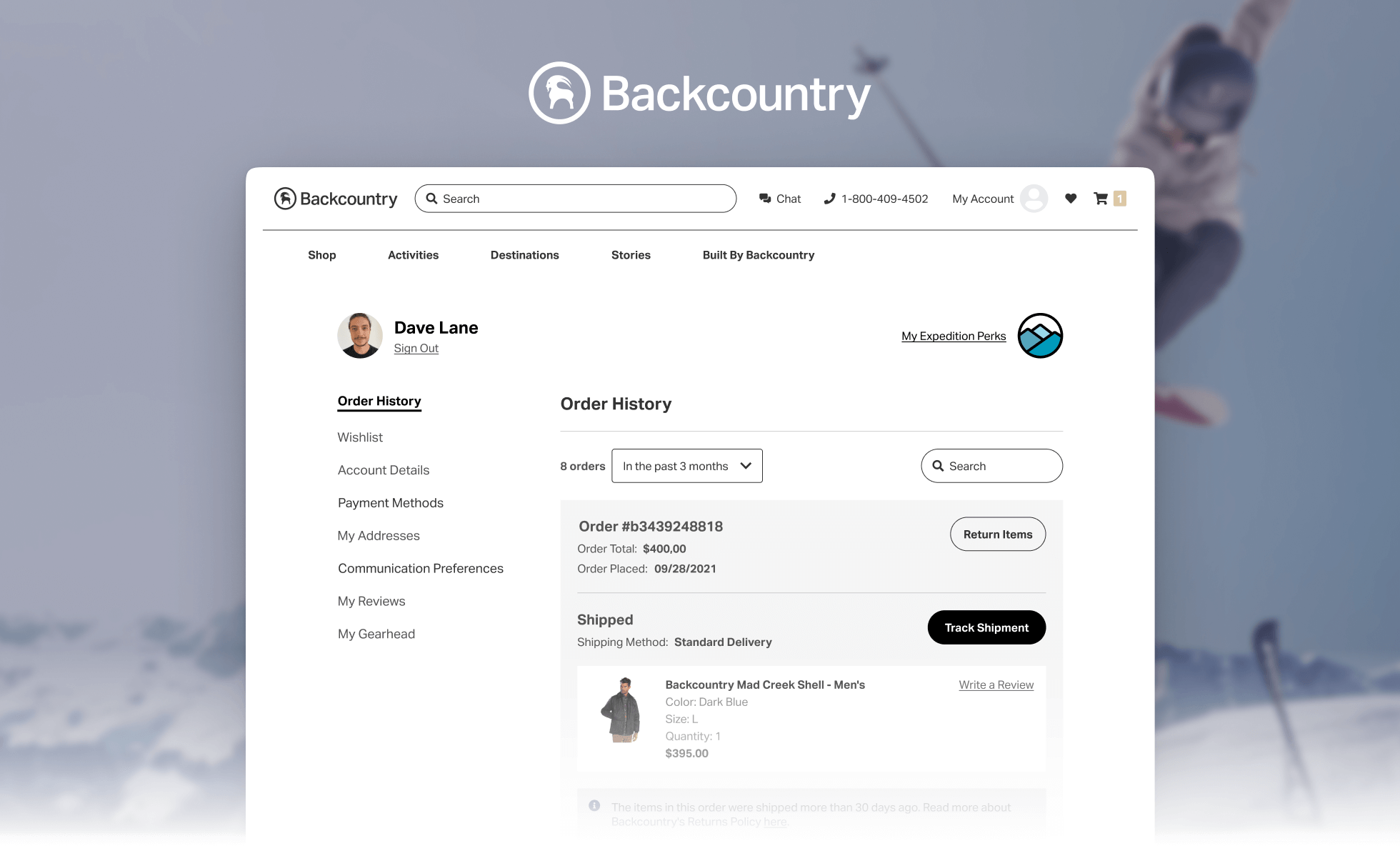
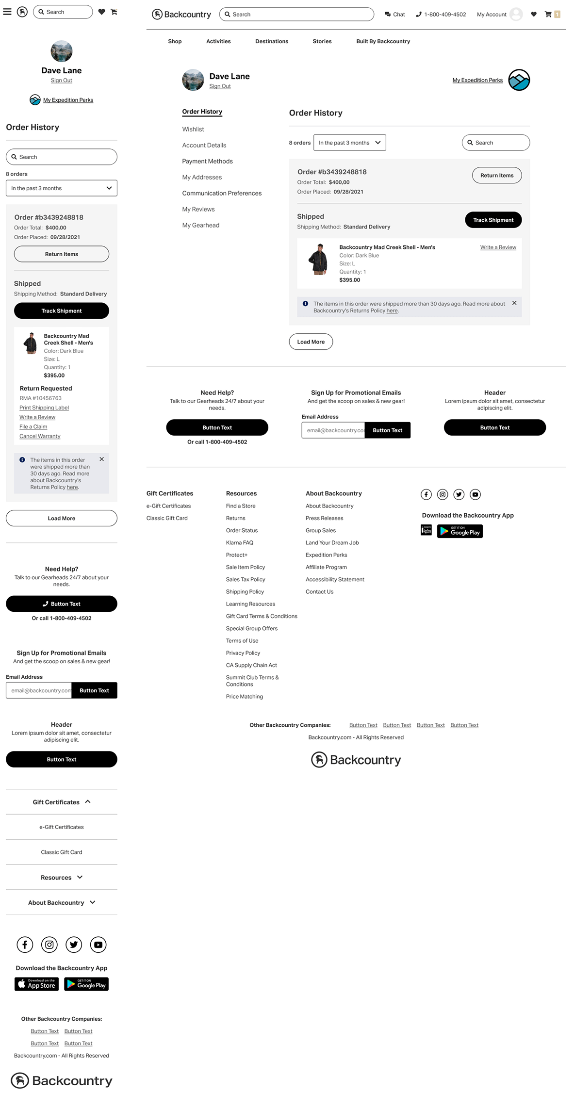
For instance, the previous design of the Profile Page had several issues, including low contrast with containers, inaccessible font colors, a confusing menu taxonomy, multiple font families, a lack of order filters, sorting, and search functionality, and a layout that was not aligned with the grid system.
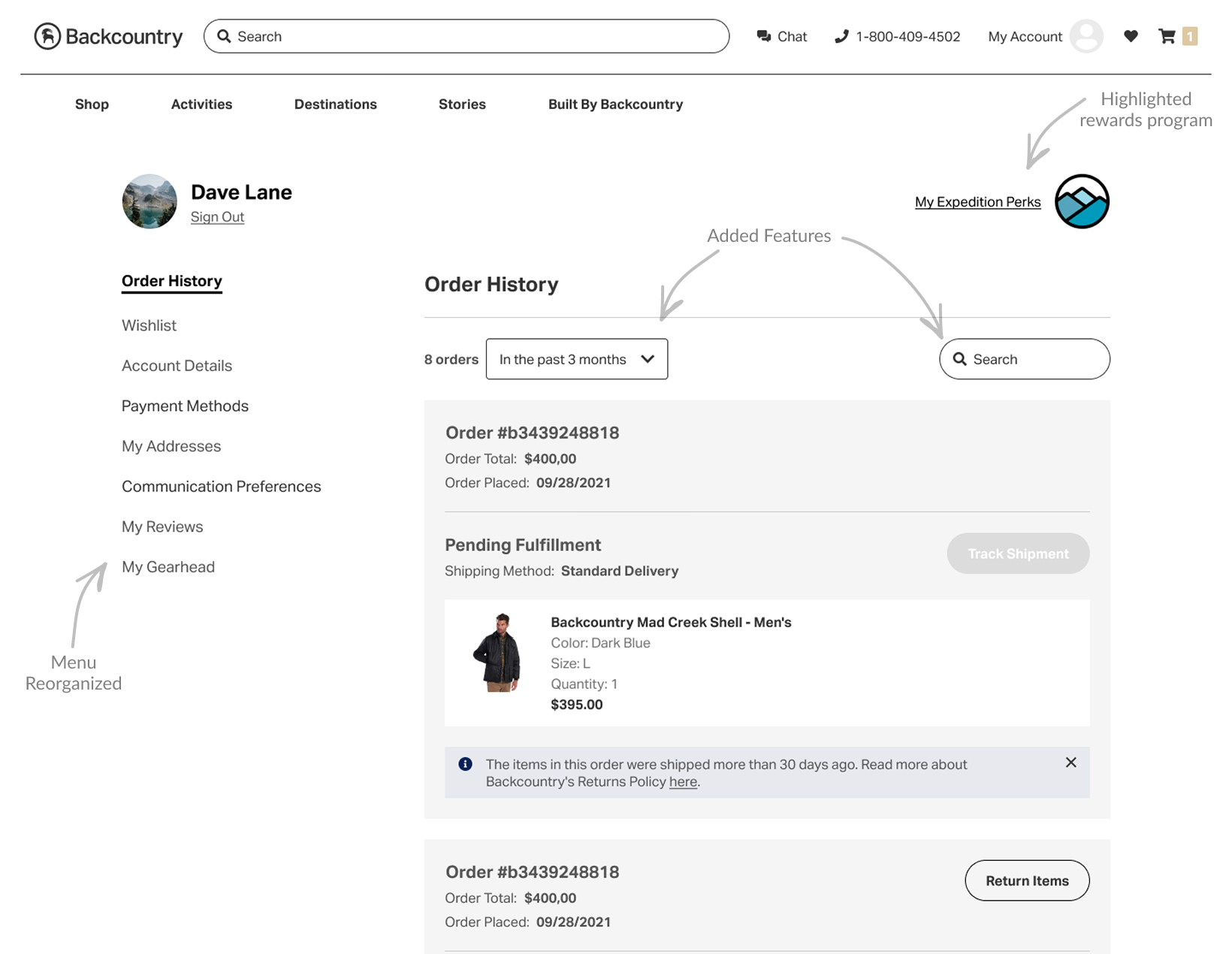
To address these problems, I enhanced contrast by adding a background color to containers and ensured font colors met accessibility standards. I reorganized the menu structure by grouping items more logically, such as unifying "Account Details" and "Account Preferences." Typography was standardized by using a single font family and establishing a clearer hierarchy with weight and sizes. I also introduced order filtering, sorting, and search functionality to align with common industry patterns. The layout was adjusted to fit within the grid system, and since the business wanted to highlight their rewards program, I placed it at the top of the page.

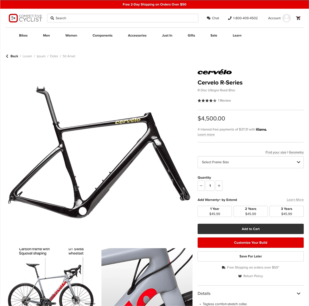
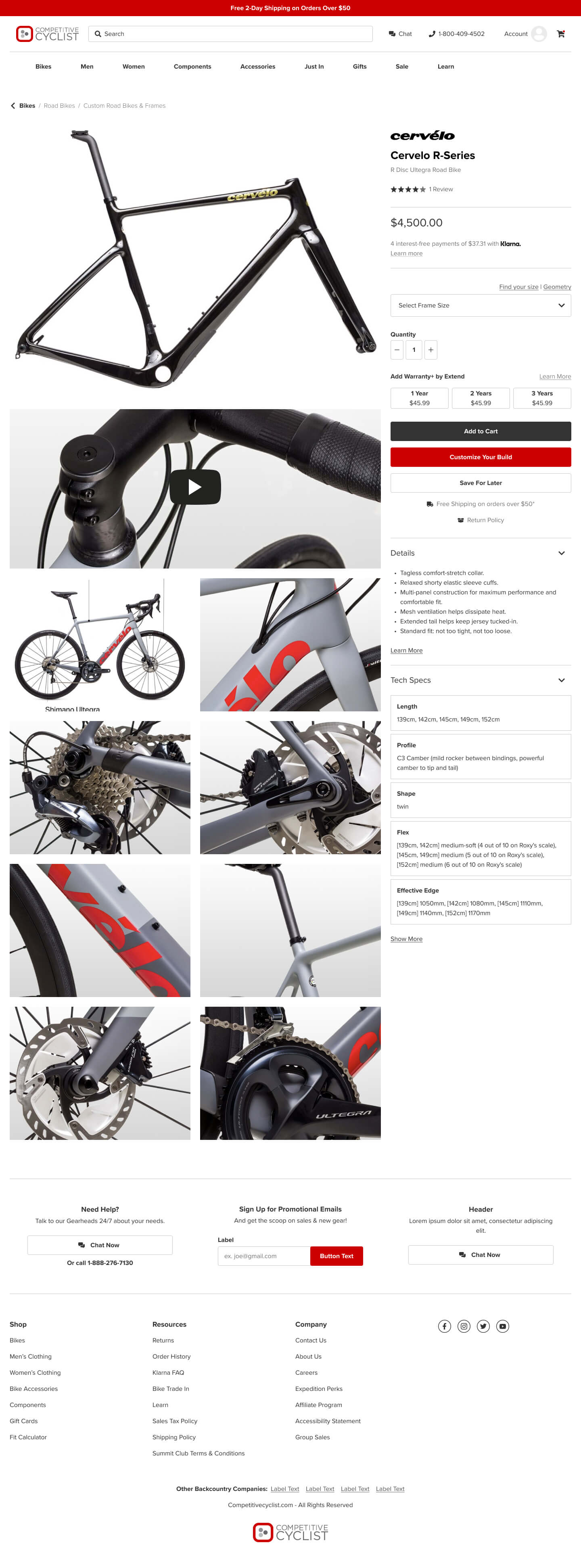
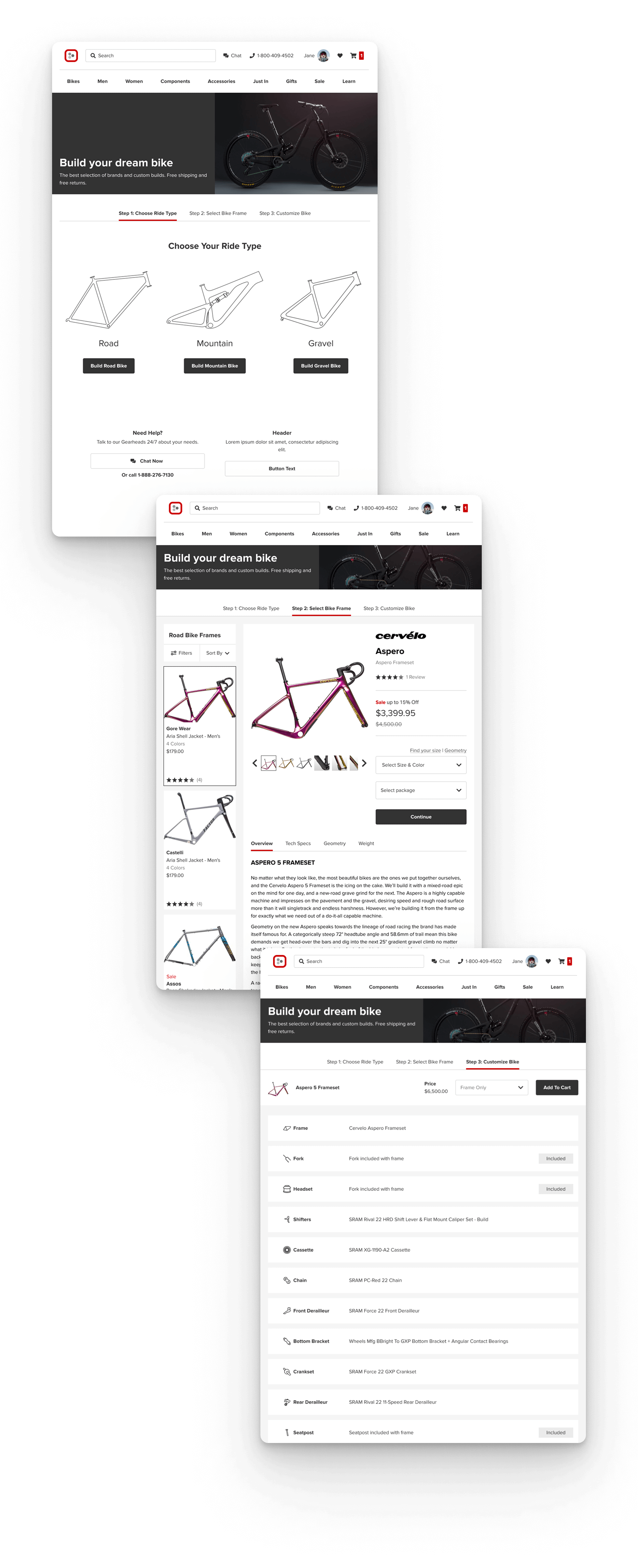
Another example was the Product Detail Page. This page had several design flaws, including a layout that was not aligned with the grid system, outdated components like the navbar, misalignments and spacing issues, and a lack of responsiveness.
I resolved these issues by aligning the layout with the grid system and updating the navbar. Spacing and margins were adjusted, improving image sizes and ensuring larger controls fit within the same space. The carousel was updated to use an image grid, and the entire page was made fully responsive. These improvements resulted in a more user-friendly and visually cohesive interface.
To maintain a smooth workflow, we structured our timeline so that designs were always two weeks ahead of development—one week for high-fidelity mockups and another for reviews and handoff preparation.
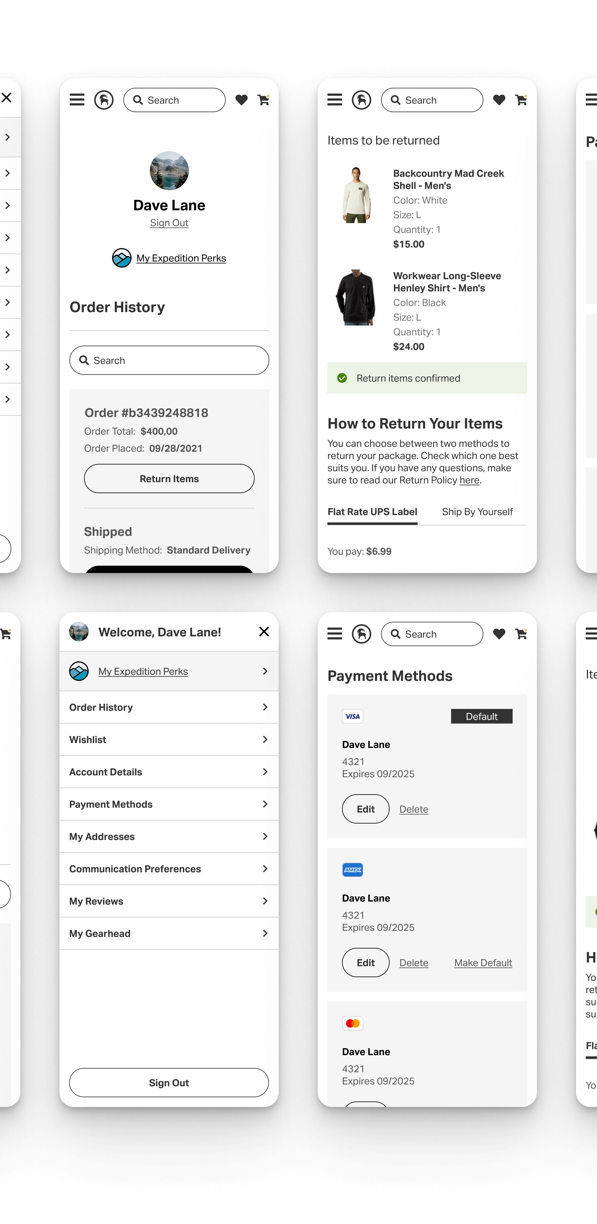
Here are more examples of the new design:


Validation
For some more complex flows that had more elements redesigned or had major changes we wanted to quick test just to make sure there was nothing too off in the solution we proposed. The idea was not to test performance at that moment but to make sure the new design wouldn't at least affect negatively the users.
For those cases, I tried for the first time the user testing tool called UserZoom with the support of research team, with a reduced amount of user in quantitative testing.
There was no major issues in the first round and in fact some feature (like Return Item) got a very hihgh results. The temam understood that this first round of user testing was enough for the project objective.

Results
The Backcountry UI refresh was an ambitious project with significant impact, both in terms of design execution and organizational influence. Over the course of four months, the team successfully designed and refined more than 1,500 screens, covering multiple breakpoints, variants, and interactions. This included:
- Conducting research to map the current sites issues and align the new UI with user needs and industry best practices.
- Reviewing and managing the UI components at all levels, from tokens to pages.
- Developing prototypes and interactive flows to quick test and enhance usability.
- Implementing a structured handoff process to the design system, ensuring long-term scalability.
Perhaps the most significant endorsement of our work came in the form of an unexpected expansion of our role. Initially focused on UI updates, the team was later invited to contribute directly to Backcountry’s design system, particularly in the development of complex organisms—a key component of scalable, reusable UI elements. This recognition underscored the value and impact of our approach, positioning our team as a trusted design partner.
The success of this initiative was further validated by positive stakeholder feedback. Casey Telenko, UX Manager at Backcountry, highlighted the effectiveness of our work, stating:
Comments are closed.